Design systems / Cross-functional craft
One component.
A shared understanding.
I contributed to Harmony while shipping healthcare products, connecting component design, practical guidance, and implementation across Figma, Zeroheight, and Storybook.
Explore the decisions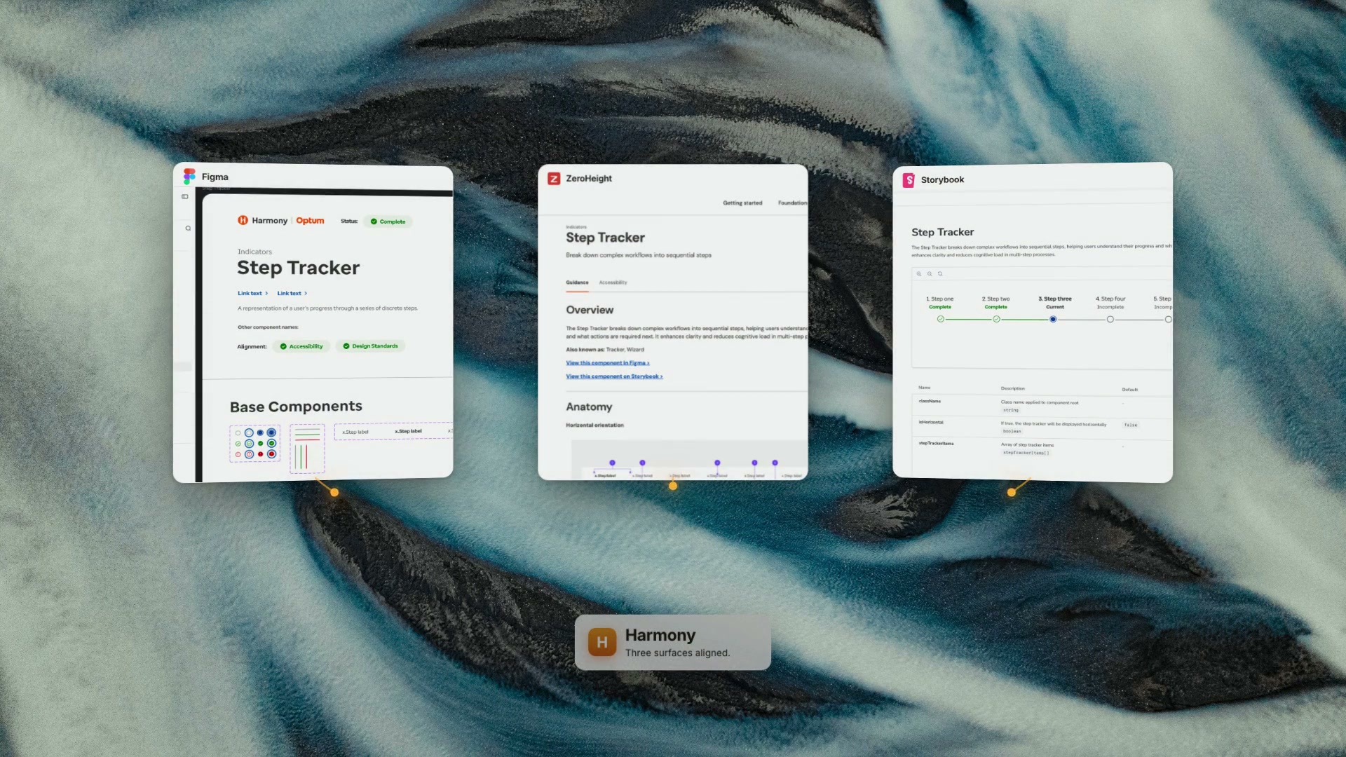
A concrete contribution across three surfaces.
System context across seven categories, not my personal output count.
Contributing from the perspective of a product designer shipping with the system.
The Step Tracker, made inspectable.
Advance the workflow to see its visual and semantic state change together.- Verify memberComplete
- Verify encounterCurrent
- Capture codesIncomplete
- Audit chartIncomplete
Each step states its progress in words as well as color. The current item carries aria-current="step", so visible and announced progress move together. Advance past the last step to reach all complete.
Rendered markup · this demonstration
<ol aria-label="Workflow progress">
  <li>Verify member</li>
  <li aria-current="step">Verify encounter</li>
  <li>Capture codes</li>
  <li>Audit chart</li>
</ol>

isHorizontal: true
stepTrackerItems: 4 items
Prop names as listed in the Harmony Storybook entry below.
States and visual anatomy
Meaning and usage guidance
Behavior and implementation
Original project artifacts below.
01 / The process
I used the system.
Then I helped improve it.
Harmony supported healthcare products across a growing organization. As a product designer working with it daily, I encountered the places where a component existed but was hard to find, where guidance was incomplete, or where a clinical workflow needed a new pattern.
I designed components, improved Zeroheight documentation, collaborated with engineers in Storybook, and encouraged product teams to reuse established patterns.
My contribution
The Step Tracker, component and pattern work for clinical workflows, documentation structure and usage guidance, accessibility collaboration, and adoption conversations.
My vantage point
A daily consumer of the system with responsibility for shipped product experiences. I could connect library decisions to the friction people encountered in actual design and handoff work.
Shared responsibility
Harmony already existed. Its roadmap, migration program, contribution process, and release communications belonged to the wider team. My work operated within that system.
02 / The process
A component can exist
and still be hard to find.
As libraries converged, their vocabularies did not line up. A component called Tag in UITK and Chip in UICL became Badge in Harmony. Searching by a familiar name could make existing work appear absent.
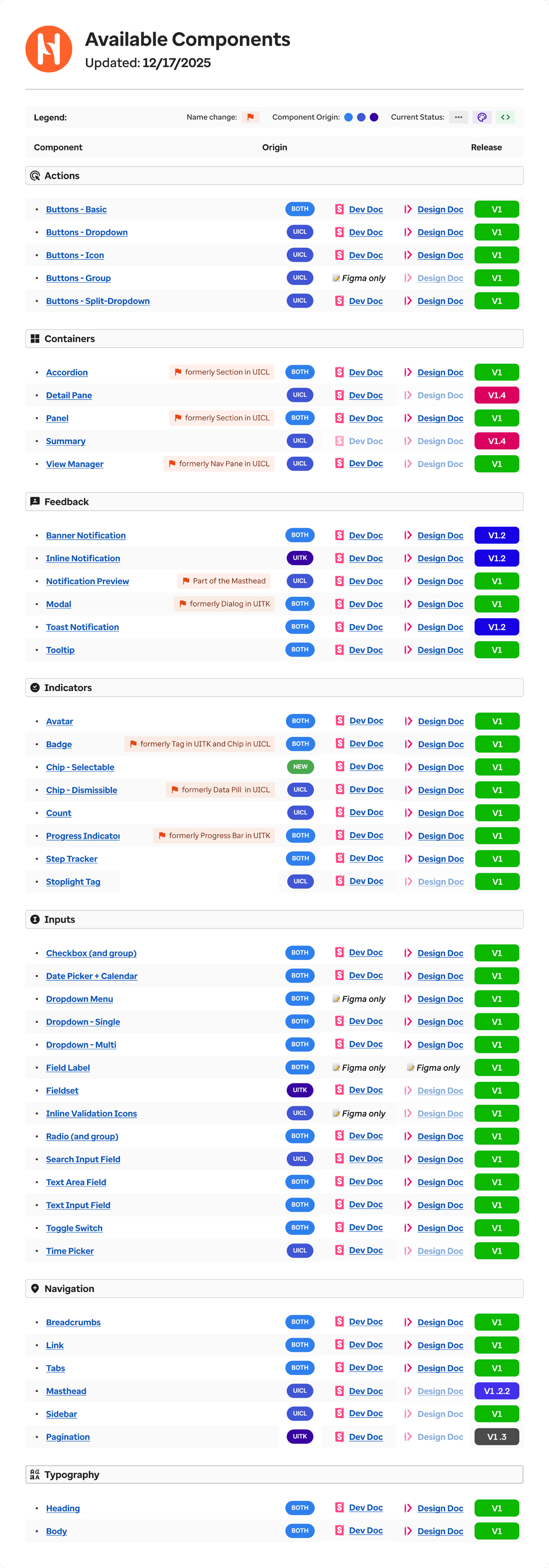
The component inventory also exposed uneven coverage: some entries had design guidance but no development documentation; others existed only in Figma. The problem was agreement across the surfaces people used.
Different names across legacy libraries
A consolidated name in Harmony
Make reuse easier than rebuilding.
I restructured Zeroheight documentation around the consolidated naming and added guidance on choosing components. When a workflow seemed to need something new, I first checked the existing library and what other teams had already solved.
Five rows from the inventory
Transcribed from the original below. Greyed-out links in the original mark missing documentation.
| Component | Name change | Origin | Dev doc | Design doc | Release |
|---|---|---|---|---|---|
| Badge | formerly Tag in UITK and Chip in UICL | BOTH | Dev Doc | Design Doc | V1 |
| Progress Indicator | formerly Progress Bar in UITK | BOTH | Dev Doc | Design Doc | V1 |
| Step Tracker | BOTH | Dev Doc | Design Doc | V1 | |
| Stoplight Tag | UICL | Dev Doc | Greyed out | V1 | |
| Field Label | BOTH | Figma only | Figma only | V1 |
The full inventory
Original Harmony inventory, updated 17 December 2025: 46 components across seven categories.
Badge sits under Indicators, a few rows above Step Tracker.
This is team-owned system context, not a list of components I personally designed.
03 / The process
The Step Tracker is the proof.
I designed the Step Tracker for workflows made of discrete stages. A useful component needs more than an attractive default state: people need to understand its anatomy, the meaning of its states, and how those states map to behavior.
These original artifacts show the component across Figma, Zeroheight, and Storybook. Numbered markers point to the detail each list describes.
01 / Define the anatomy
Figma: the parts every state is built from.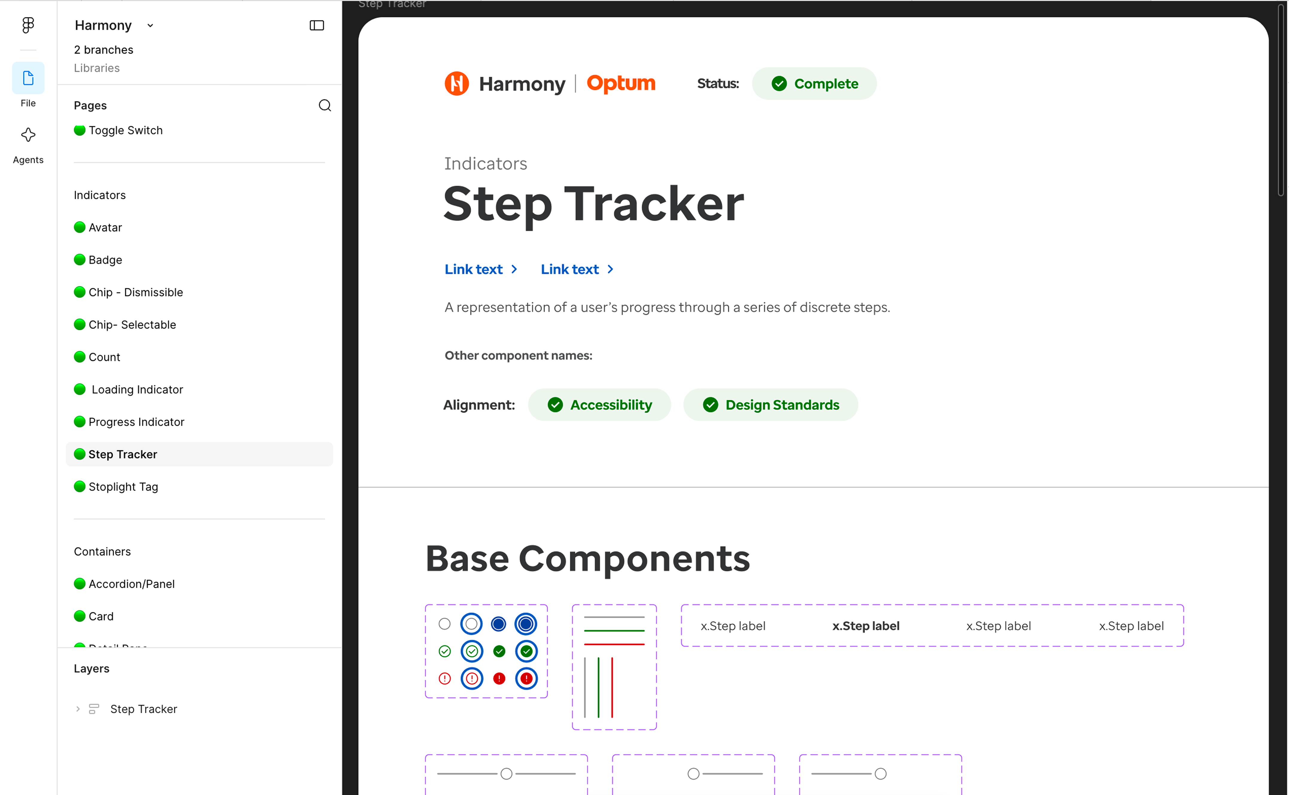
- 1Marker states: incomplete, current, complete and error, each with a focus-ring variant.
- 2Connector lines in grey, green and red, for horizontal and vertical layouts.
- 3Step labels, with the current step set in bold.
- 4Status Complete, with Accessibility and Design Standards alignment checked.
02 / Explain when and how to use it
Zeroheight: purpose, other names, and anatomy in words.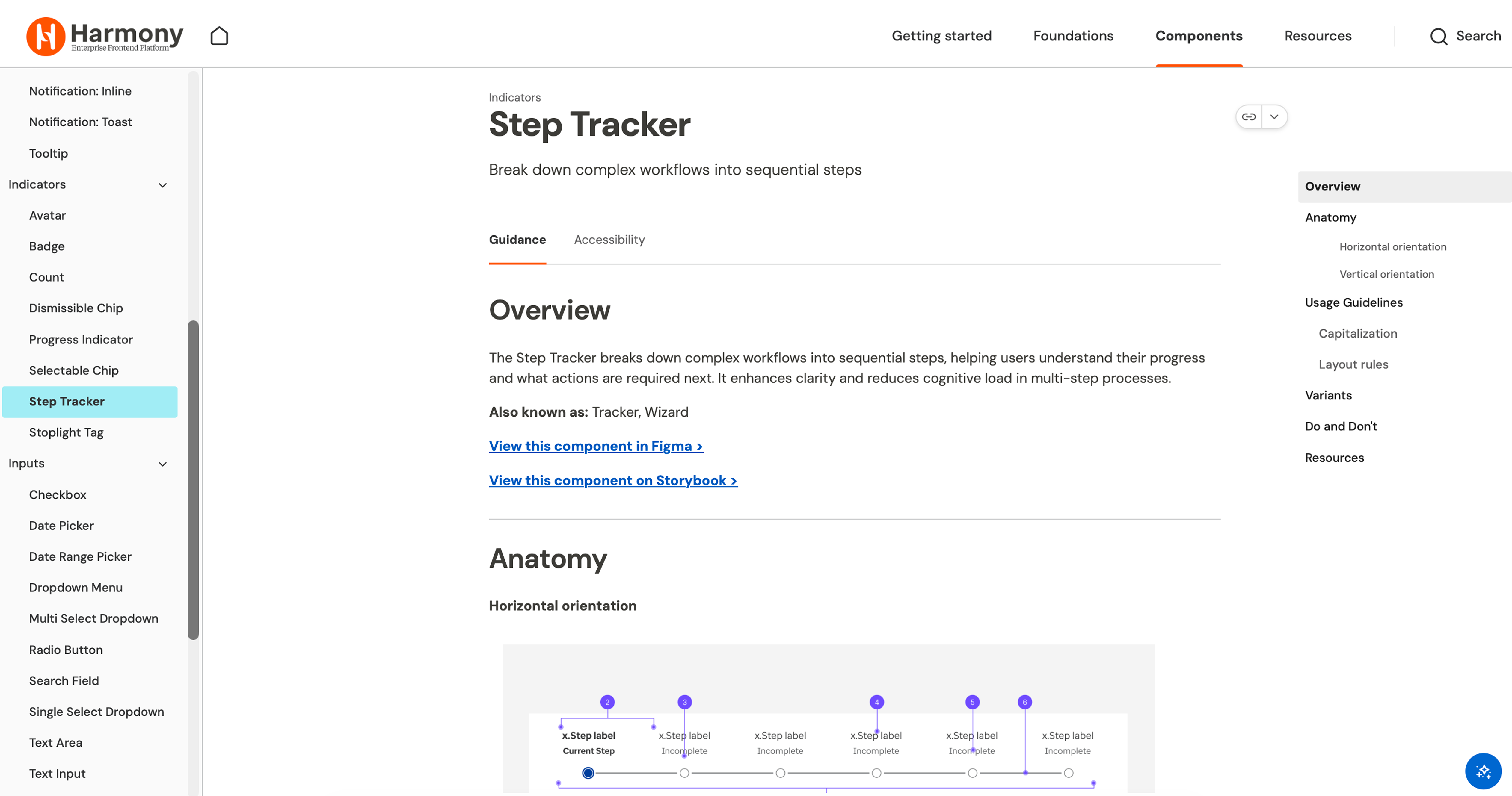
- 1Guidance and Accessibility tabs. The outline covers anatomy, usage, variants, and Do and Don’t.
- 2“Also known as: Tracker, Wizard.” A search under another name still finds the entry, the problem the Badge rename exposed.
- 3Direct links to the component in Figma and on Storybook.
- 4Anatomy names each state in text: Current Step, Incomplete.
03 / Inspect the implemented states
Storybook: the rendered component and its props.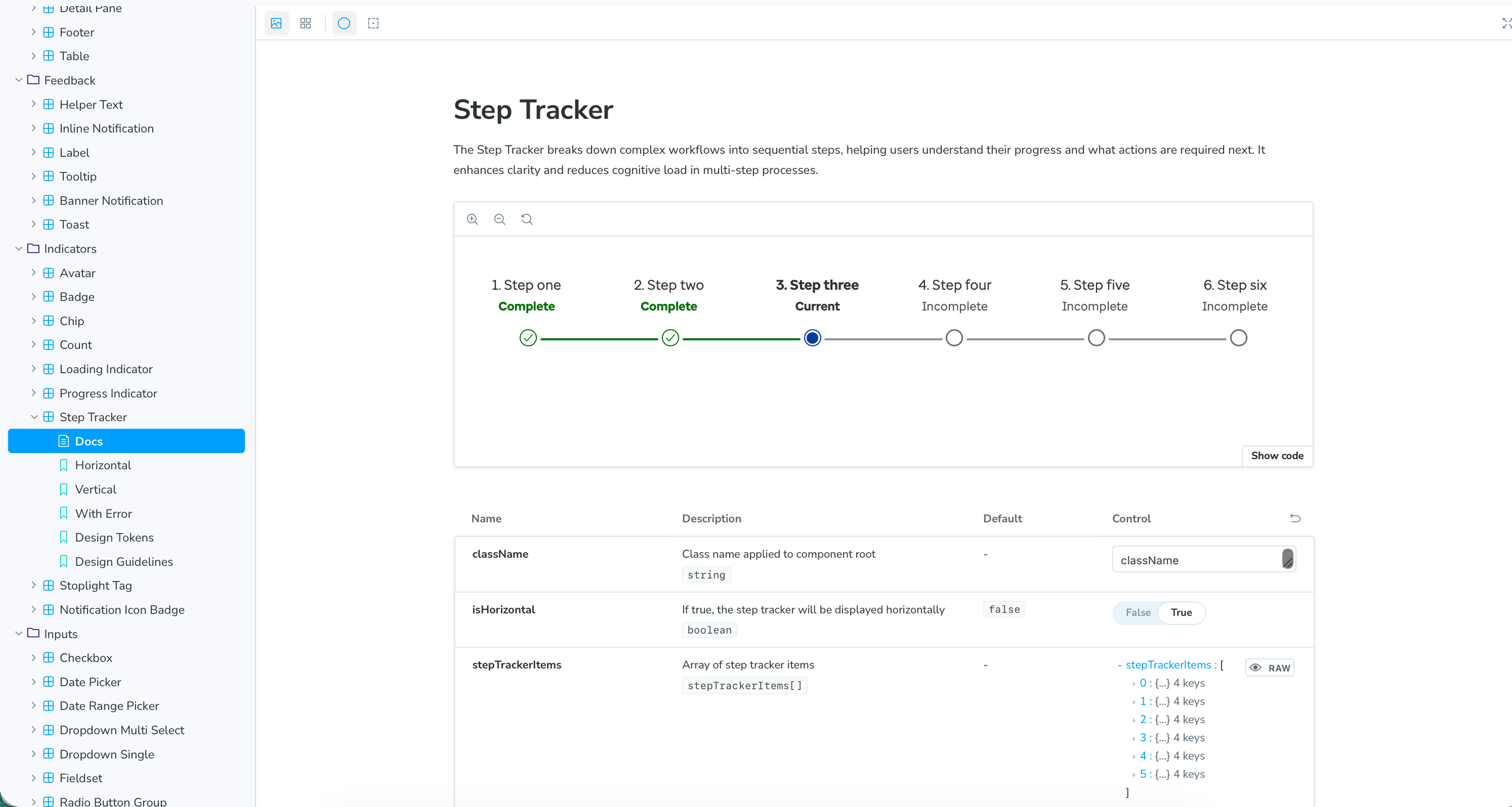
- 1Rendered states: Complete, Current and Incomplete, written under each step name.
- 2
isHorizontal: boolean, default false. - 3
stepTrackerItems[]: an array with one entry per step. - 4Stories for Horizontal, Vertical and With Error.
The three surfaces can drift apart again. Keeping them aligned takes maintenance; publishing them once does not guarantee it.
04 / The process
Bring engineering in
while decisions are still open.
I worked within Harmony's existing Prebuild process to align with engineers before committing to a new component. We checked the need, existing patterns, states, and edge cases together.
For the Step Tracker, the engineering discussion brought semantic list markup and aria-current="step" into the design. It connected the visible progress state to something assistive technology could understand.
The Prebuild review changed the markup
Reconstructed from my project notes, not the original spec file.
<div class="step done">…</div>
<div class="step active">…</div>
<div class="step">…</div>
Styled containers. Progress existed only visually.
<ol aria-label="Workflow progress">
  <li>…</li>
  <li aria-current="step">…</li>
  <li>…</li>
</ol>
A list with a current item that assistive technology can announce.
- My part
- The visual spec and states, the Zeroheight guidance, and bringing the component to engineers before build.
- Engineer’s part
- Proposed the semantic list and
aria-current="step". - Team process
- Prebuild review is part of Harmony’s contribution model. I worked within it; I did not create or own it.
Accessibility is behavior, too.
Semantic markup communicates the current step; it does not automatically make every interaction keyboard accessible. Focus behavior, keyboard interaction, and visual states still need to be considered with engineering.
The value of reuse was attention freed for the difficult parts of the clinical workflow.
Contribution also meant helping others use it.
I encouraged other product teams to adopt existing patterns rather than rebuild them. Adoption depended on clear guidance and direct conversations. As a contributor, I could reduce the friction of reuse and bring product needs back to the system team.
05 / The process
What happens when an agent uses the system?
Agents can generate plausible UI quickly, including plausible components and tokens that do not exist. My experience with documentation drift led to a personal experiment: make a component's boundaries explicit and validate generated output against them.
I explored contracts describing allowed states, props, tokens, slots, and accessibility requirements. The question was whether a request outside those boundaries would become a visible decision instead of an unnoticed fork.
Same request. Different boundaries.
Personal experiment · 2026The request: “Add a partial-completion state to the step tracker that shows a percentage bar inside each step, so a clinician can see a review is 60% done.”
Without the contract · 0/100
23 violations
undeclared-prop   2  steps, orientation
undeclared-state  4  partial, completed,
                     skipped, error
missing-state     1  complete, blocked
undeclared-token  9  step-tracker/progress-fill,
                     progress-track, bg-*, text-*
undeclared-slot   4  stepIcon, stepLabel,
                     stepDescription, progressBar
missing-slot      1  label
a11y              2  visible-focus,
                     keyboard-navigable
The agent satisfied the request by inventing a parallel definition: new props, a “sixth state alongside the existing five” where the contract declares four, and nine undeclared tokens.
With the contract · 100/100
Refused. The contract defines exactly
four states: not-started, in-progress,
complete, blocked.

To add this capability, amend the
contract first: add a 'partial' state
and a 'progress' prop (number, 0 to
100), then re-request.
The constrained output declined the unsupported capability and named the amendment. The gap became a reviewable system decision.
Condensed from the recorded live run on 10 September 2026: one request, one run per condition. The contract is my own simplified definition, not Harmony’s Storybook API. An observed behavior, not a benchmark or an Optum production rollout.
Check a definition against the contract
A miniature validator written for this page. It applies the experiment’s state, prop and slot rules to fixed example definitions. No AI model is called.
The checked definition and every violation found appear here.
The validator needed scrutiny, too.
Testing exposed an empty component definition that scored 70/100 because missing fields skipped the checks. I made broken structure score zero. A quality gate is itself a product that needs testing.
Across the recorded experiments, constraints reduced invented definitions, but some structural errors remained. Two observations do not establish reliability. A broader set of requests and repeated runs would be needed to evaluate that.
Design systems need clear boundaries for people and agents.
Harmony gave me practice making those boundaries understandable across design and engineering. The contract experiment extends that question into AI-assisted work: how do we make an unsupported decision visible before it becomes another inconsistency?