At a glance
- My role
- Product Designer on Optum products, building with Harmony and contributing to it every day for two years.
- What I was responsible for
- Redesigning the Step Tracker on all three surfaces, merging its UITK and UICL versions; taking components to engineers at Prebuild; and answering component questions in the Harmony Teams channels. The system team owned Harmony's roadmap, the library merge, release notes and the contribution process; I worked inside them.
- What zero looked like
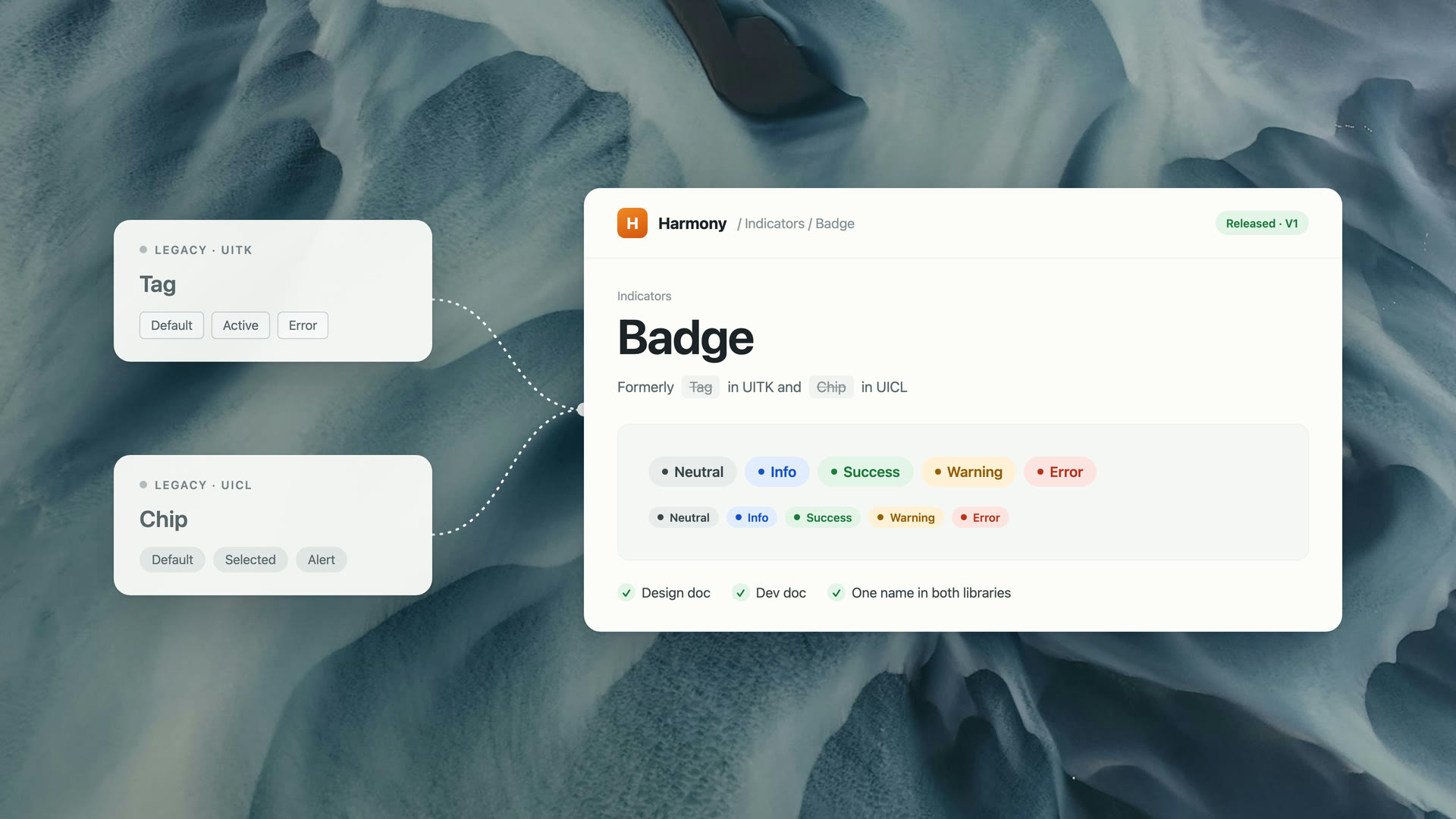
- Two legacy libraries merging into Harmony with different names for the same component. Harmony's Badge was called Tag in one old library and Chip in the other.
- What was at stake
- People searched by the name they knew, found nothing, and assumed the component didn't exist. Teams rebuilt work that was already in the library.
- The key decision
- Take components to engineers at Prebuild, while the spec was still open, instead of handing off a finished spec.
- What shipped
- The Step Tracker in Figma, Zeroheight and Storybook, with semantic markup agreed at Prebuild, and guidance on choosing between components.
Impact
- 2Legacy libraries merged into HarmonyUITK and UICL
- 46Components in the merged systemHarmony inventory, 17 December 2025
- 3Surfaces the Step Tracker shipped onFigma, Zeroheight and Storybook
Counts of the system and of shipped work, not usage. There was no measure of failed searches or rebuilt components, so I don't claim one.
What I noticed
The same component had three names.
As a consumer of the system, I kept hitting the same friction. Badge was called Tag in UITK and Chip in UICL. Search for the name you grew up with and the library looked empty.
Different names across legacy libraries
A consolidated name in Harmony
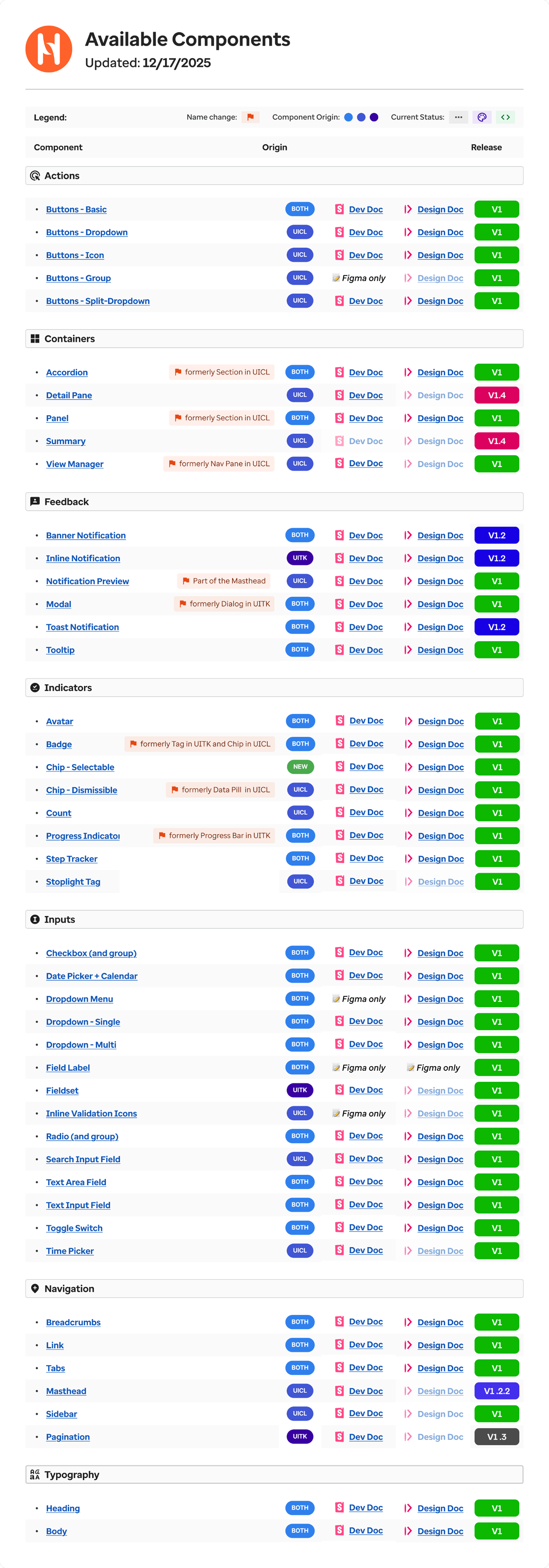
The inventory showed the same pattern at scale. Some components had development docs but no design docs; others existed only in Figma.
Five rows from the inventory
Transcribed from the original below. Origin is the legacy library a component came from; BOTH means it existed in both. A missing doc link marks a gap.
| Component | Name change | Origin | Dev doc | Design doc | Release |
|---|---|---|---|---|---|
| Badge | formerly Tag in UITK and Chip in UICL | BOTH | Dev Doc | Design Doc | V1 |
| Progress Indicator | formerly Progress Bar in UITK | BOTH | Dev Doc | Design Doc | V1 |
| Step Tracker | BOTH | Dev Doc | Design Doc | V1 | |
| Stoplight Tag | UICL | Dev Doc | Greyed out | V1 | |
| Field Label | BOTH | Figma only | Figma only | V1 |
The full inventory
Original Harmony inventory, updated 17 December 2025: 46 components across seven categories, built by the system team.
Cropped to Indicators: Badge sits a few rows above Step Tracker. Enlarge shows all seven categories.
Drift was not only between the old libraries. Inside Harmony, the docs and the inventory disagreed.
Drift, in one screen
Harmony's Zeroheight sidebar. The inventory above names the same components differently.
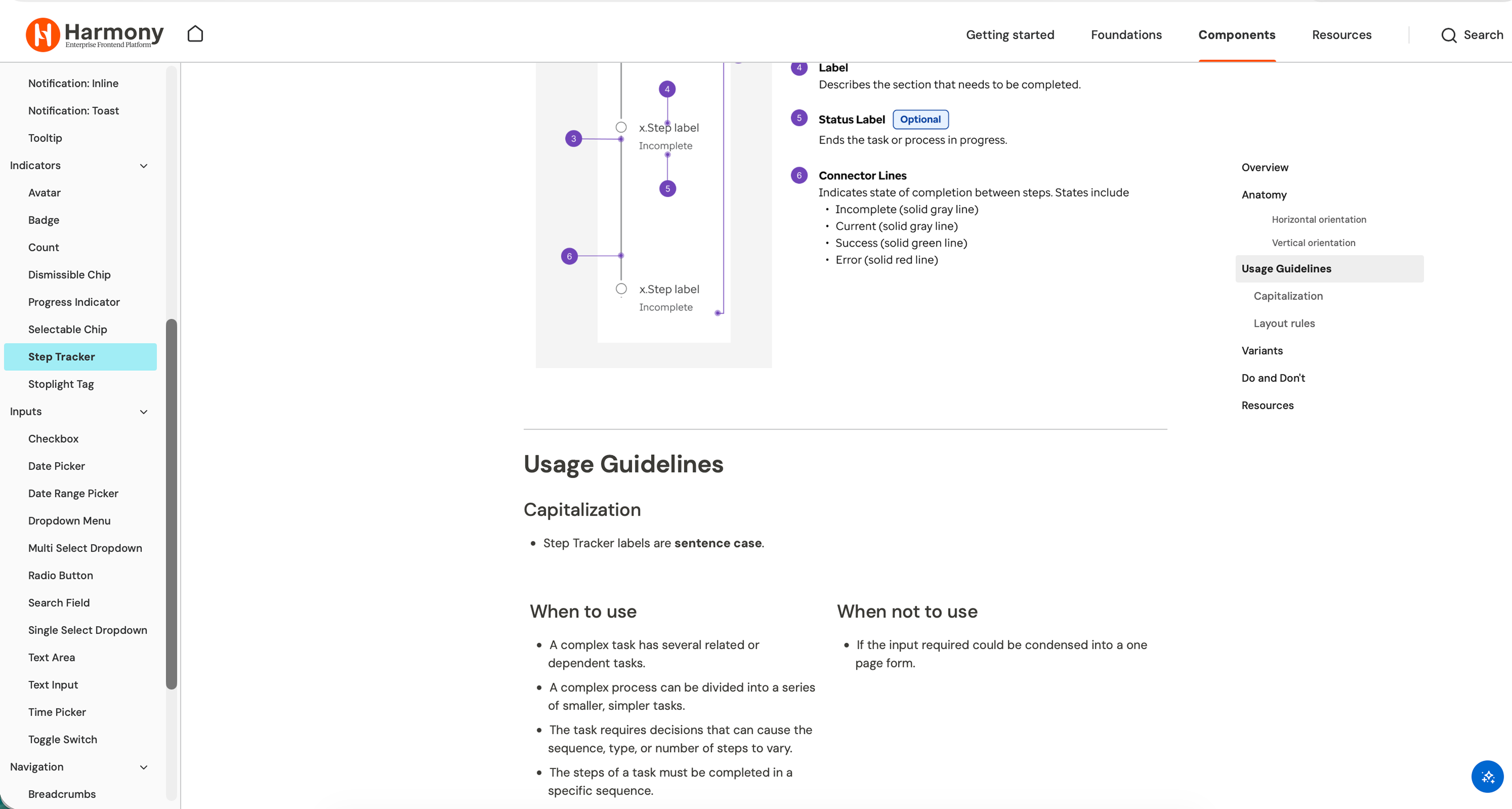
- 1“Dismissible Chip” here, “Chip - Dismissible” in the inventory.
- 2“Date Range Picker” has a docs page but no row in the inventory.
- 3“Multi Select Dropdown” here, “Dropdown - Multi” in the inventory.
Renaming was the system team's call. What I could change was how my own components reached engineers.
The reframe
The gap wasn't missing components. Nobody was checking.
Adding more components wouldn't have helped. The failure was that three surfaces had stopped being checked against each other, because checking them was nobody's job.
A designer specced, an engineer built, a writer documented, and each surface drifted on its own schedule. The gaps showed up later, as rebuilt components and search that came back empty.
HypothesisShorten the loop between designer and engineer. That does more than adding components.
Shorten the loop
Bring engineering in while decisions are still open.
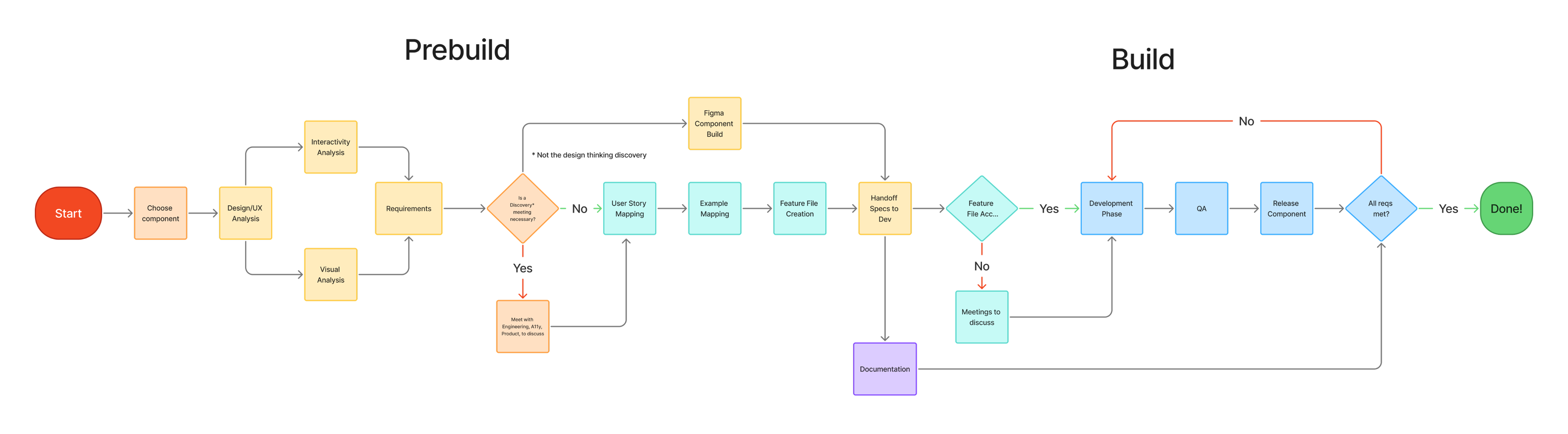
Harmony's contribution process already had a Prebuild step, a review before anything is built. I used it to take components to engineers before committing to a spec: we checked the need, existing patterns, states, and edge cases together.
Harmony's component creation process
The system team's original diagram.
Where I sat in that process
Redrawn from the diagram above. Filled steps are the ones I did for the Step Tracker; the process itself is the team's.
Prebuild
- Choose component
- Design, interactivity and visual analysis
- Requirements
- Discovery meeting with Engineering, Accessibility and Product, when needed
- User stories and examples
- Written acceptance criteria
- Figma component build
- Handoff specs to development
Build
- Documentation in Zeroheight
- Acceptance check
- Development
- QA
- Release
Filled steps are the ones I did; outlined steps were the team's.
- Decision
- Take components to engineers at Prebuild, not at handoff.
- Rejected
- Specifying alone, then handing off.
- Why
- In my experience, the components I specced alone were the ones that came back from build for rework.
- What it cost
- Control of the spec. Engineering's review replaced my markup, as the Step Tracker below shows.
The Prebuild review changed the markup
The markup pattern before and after review, simplified.
<div class="step done">…</div>
<div class="step active">…</div>
<div class="step">…</div>
Styled containers. Progress existed only visually.
<ol aria-label="Workflow progress">
  <li>…</li>
  <li aria-current="step">…</li>
  <li>…</li>
</ol>
A list with a current item that screen readers (assistive technology) can announce.
Where I pulled back
I had specced the Step Tracker as styled divs. An engineer proposed an ordered list with aria-current="step", and I took it. Their experience was the better signal.
Where I pushed
Adoption. In Teams threads and design reviews, I talked other teams into using existing components instead of rebuilding them. Most of what worked was conversation.
Harmony's developer support process
The system team's original diagram. Expert names blurred.
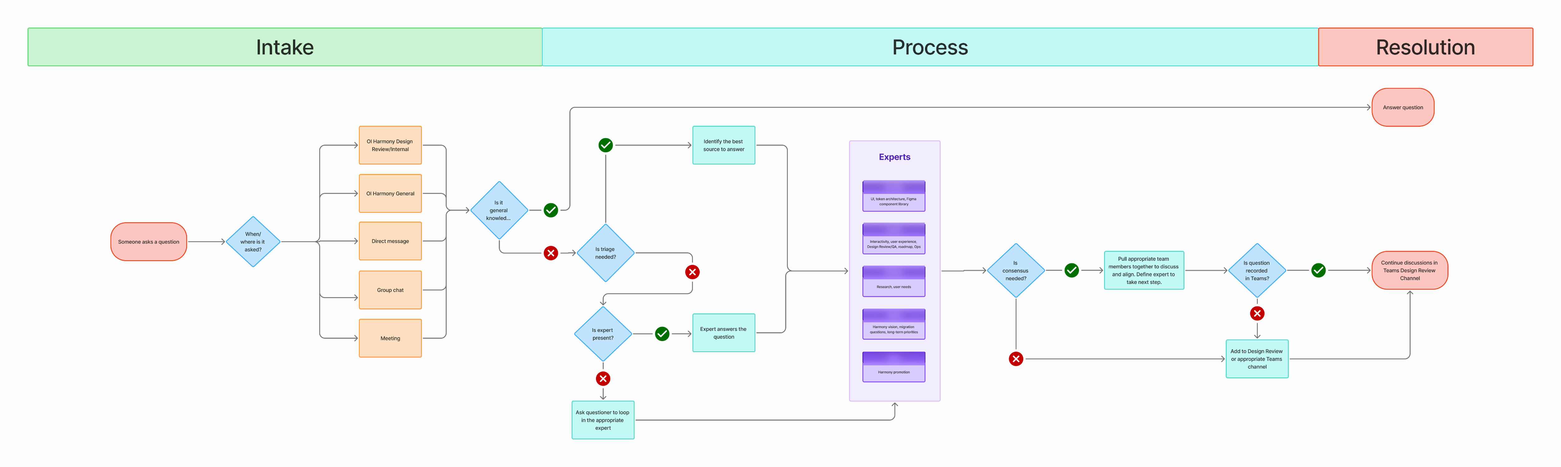
Both sides of the support channel
Redrawn from the diagram above. Dark rows are my part.
- Intake
- Questions arrive in the Harmony Teams channels, DMs, group chats and meetings.
- I answered component questions from designers and engineers, usually by pointing to what already existed.
- Triage
- General knowledge gets an answer. Anything else goes to the expert panel, which decides if it needs consensus.
- I escalated my own questions when a gap needed a system decision.
- Resolution
- An answer, or a thread in the design review channel.
Semantic markup doesn't automatically make every interaction keyboard accessible. What it did here was connect the visible progress state to something assistive technology can announce.
One component
One component, three surfaces.
The Step Tracker existed in both legacy libraries. I redesigned it as one Harmony component, merging the UITK and UICL versions. It serves workflows made of discrete stages. A useful component needs more than an attractive default state: people need its anatomy, the meaning of each state, and how those states map to behaviour. Try it below; the visible state and the markup change together.
- Verify memberComplete
- Verify encounterCurrent
- Capture codesIncomplete
- Audit chartIncomplete
Each step states its progress in words as well as colour. The current item carries aria-current="step", so visible and announced progress move together. Advance past the last step to reach all complete.
Rendered markup · this demonstration
<ol aria-label="Workflow progress">
  <li>Verify member</li>
  <li aria-current="step">Verify encounter</li>
  <li>Capture codes</li>
  <li>Audit chart</li>
</ol>

isHorizontal: true
stepTrackerItems: 4 items
Prop names as listed in the Harmony Storybook entry below.
States and visual anatomy
Meaning and usage guidance
Behaviour and implementation
Figma: define the anatomy
The parts every state is built from.
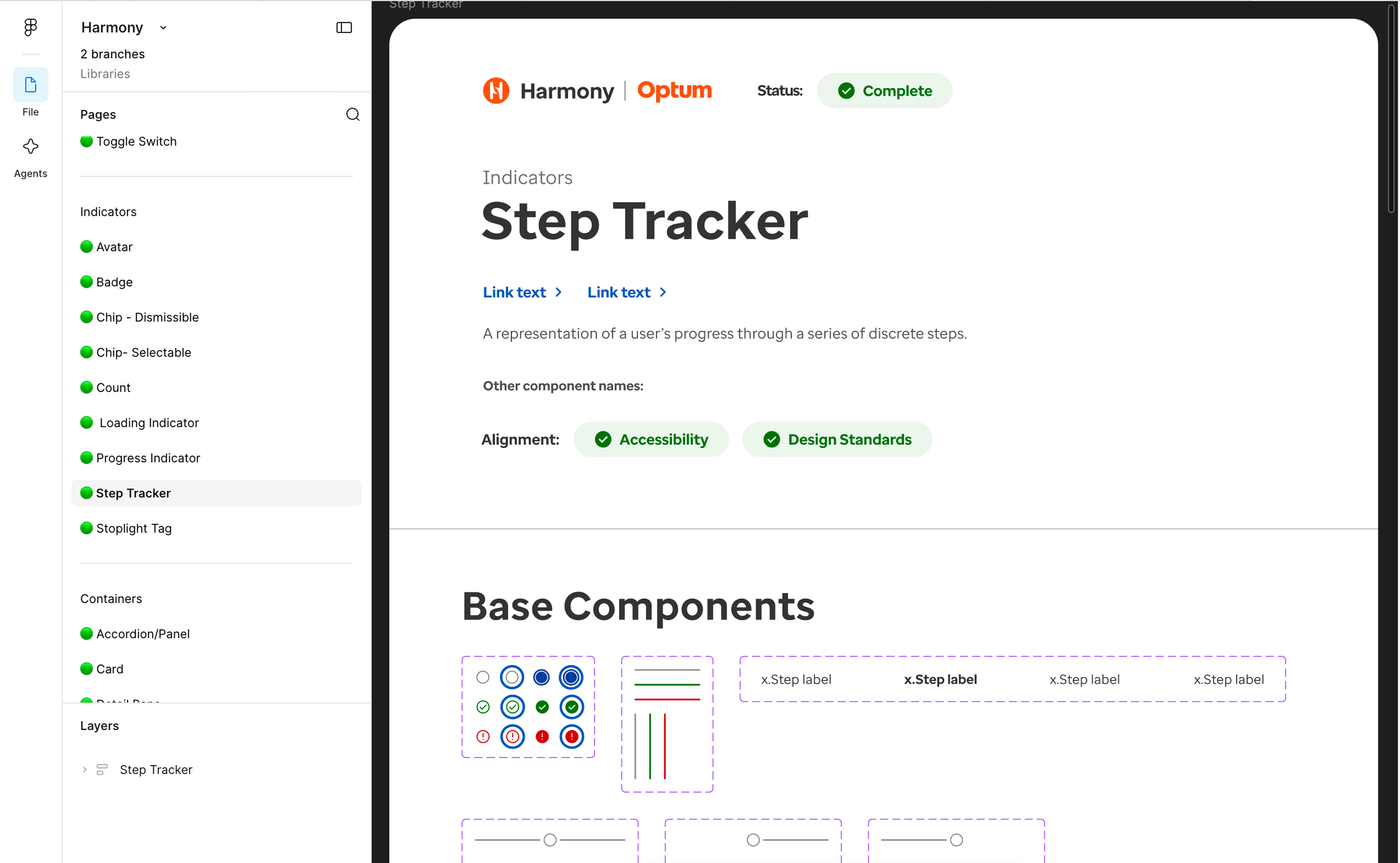
- 1Marker states: incomplete, current, complete and error, each with a focus-ring variant.
- 2Connector lines in grey, green and red, for horizontal and vertical layouts.
- 3Step labels, with the current step set in bold.
- 4Status Complete, with Accessibility and Design Standards alignment checked.
Zeroheight: explain when and how to use it
Purpose, other names, and anatomy in words.
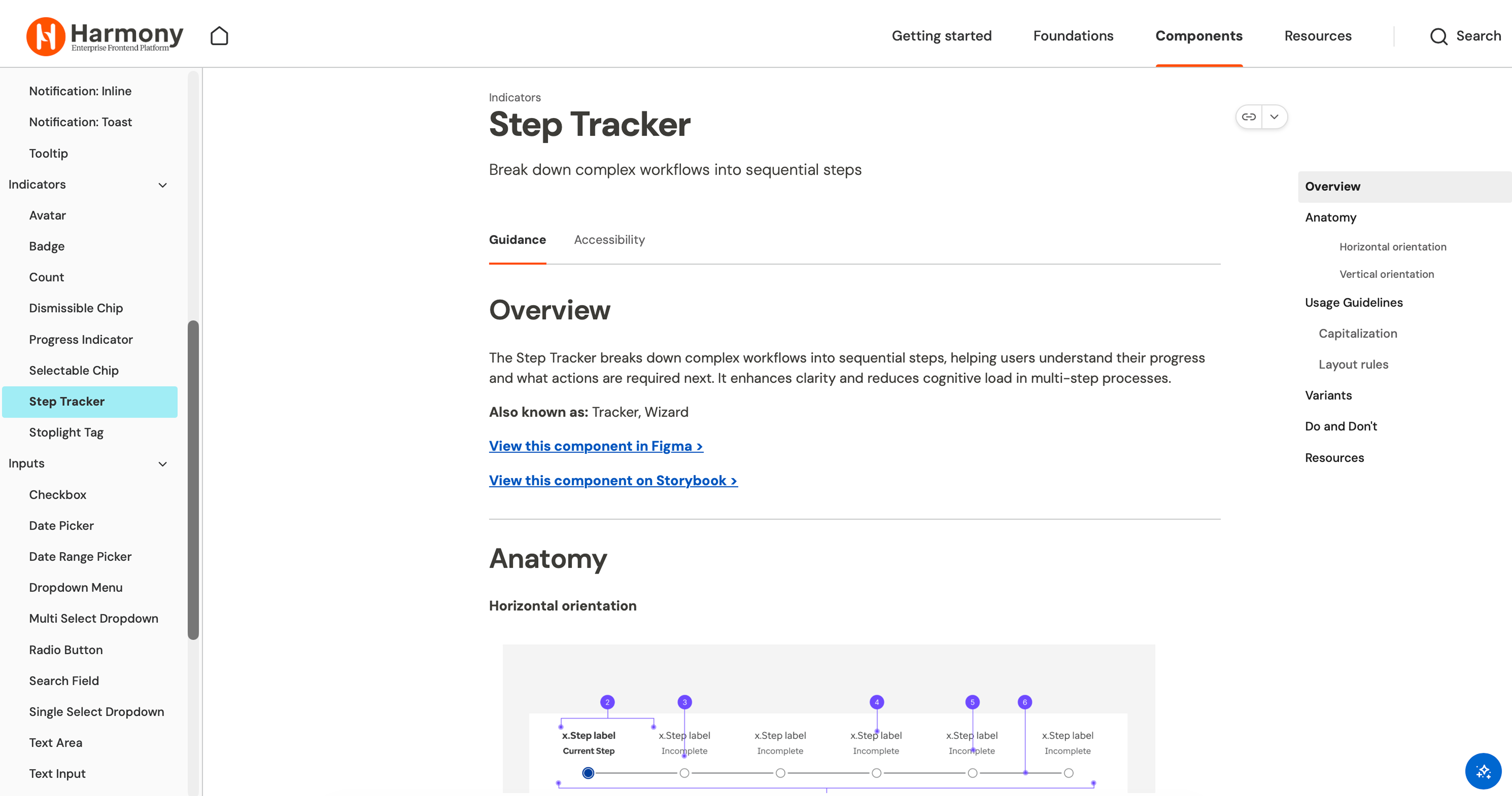
- 1Guidance and Accessibility tabs. The outline covers anatomy, usage, variants, and Do and Don't.
- 2“Also known as: Tracker, Wizard.” A search under another name still finds the entry, the problem the Badge rename exposed.
- 3Direct links to the component in Figma and on Storybook.
- 4Anatomy names each state in text: Current Step, Incomplete.
Storybook: inspect the implemented states
The rendered component and its props.
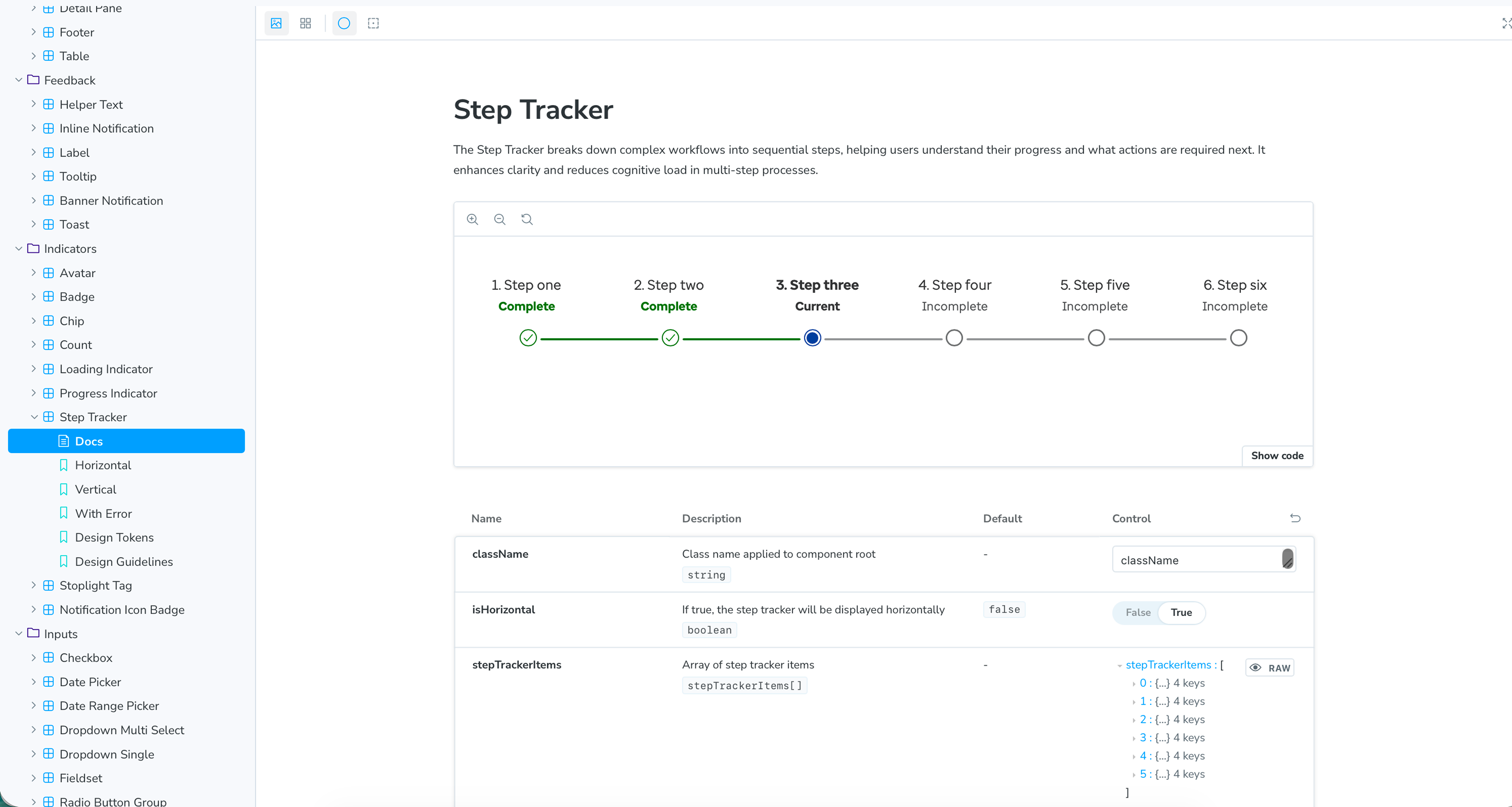
- 1Rendered states: Complete, Current and Incomplete, written under each step name.
- 2
isHorizontal: boolean, default false. - 3
stepTrackerItems[]: an array with one entry per step. - 4Stories for Horizontal, Vertical and With Error.
Human + AI
A design system an agent can't drift from.
A personal project after Optum, built with Astryx, an open design system, and Jev, TypeSafe's decision model. Harmony taught me where drift starts: someone builds outside the system and nobody notices. AI agents do that at speed. Ask one for a screen and it writes plausible components and tokens that don't exist.
So I took away the agent's ability to write UI. Jev never generates code. It answers choice questions from the system's own menu: which of 51 page templates, which of 7 themes, which section recipes in which order. A renderer then draws real Astryx components. When Jev's confidence drops below 50%, a hybrid route hands the screen to a larger model, which still has to answer in the catalog's schema.
- 0 off-system components
- By construction. The renderer only knows Astryx components, so there is nothing else it can draw.
- 100% and 95%
- Template and theme picked correctly on 20 hand-labelled briefs, median 333 ms, $0.0038 for all 20 together.
- 14 of 16
- Briefs won in a blind judge against Shapeshift, a generative UI reference app. The judge saw both results without labels.
- 18 of 18
- Hybrid screens valid against the catalog schema in the latest run, first paint at a median 475 ms. 2 of the 20 briefs errored before producing a screen. The two runs before it had 9 and 8 of 20 valid.
Say it, get the card
Six briefs typed into the live lab. The card changes as the meaning does, and every card works. The usage page logs each call: 6 calls, median 353 ms, $0.00087 in total.
Same brief, two ways
Left, Jev picks one of 39 hand-built cards. Right, Claude Sonnet 5.5 writes the card from scratch with Astryx components. Over 20 briefs: Jev 20 of 20 right, median 0.69 s. Sonnet 15 of 20, median 11.7 s; its 5 misses crashed on render. Sonnet's wait plays at 8x.
The shiftAt my next team, the design system stops being a library people search and becomes the menu agents choose from. Off-system work stops being a quiet fork and becomes a visible decision.
Try the live lab (opens in a new tab)Type a brief in plain words and watch Jev pick the card.
Numbers come from my own eval scripts and briefs, not an independent benchmark. The lab is a personal project, not Optum work.
Reflections
What I learned, and what's next.
Bring engineering in while the spec is still open.The Step Tracker's accessible markup came from an engineer at Prebuild, not from me. I now treat that review as part of design, not a gate after it.
Adoption is a conversation.The library made reuse possible. Conversations in Teams threads and design reviews made it happen.
A shared library has limits.Dense clinical screens, like the coding workflow in Adaptive Coder, packed dozens of diagnosis codes into one view. Those patterns didn't belong in Harmony, so we built them locally.
Constrain the agent, not the output.Checking generated UI after the fact catches drift late. When the agent can only choose from the system's menu, there is nothing off-system to catch.
What I'd do differently
Measure before restructuring. I can show what shipped, but not what it saved. Counting rebuilt components or failed doc searches before and after would have shown whether the system got easier to use.
What's next
Run the lab on a production design system with real product briefs, and calibrate the 50% escalation threshold instead of picking it by eye.
Limits: documentation can't stop drift, only make it visible, so the three surfaces need ongoing upkeep.
Two libraries became one system. The next user is an agent.